What Color Carpet Is Popular Now? 2026 Trends for Rugs and Flooring
Carpet Color & Trend Selector for 2026
Use this tool to find the perfect carpet color based on your room's lighting and lifestyle needs.
Recommended Choice:
Why This Works:
Walk into a living room painted in stark white or cold greys, and you might feel like you’re standing in an airport lounge. It’s clean, sure, but it lacks soul. That is exactly why the conversation about carpet color has shifted dramatically in recent years. We are moving away from the era of trying to match every single element in a room perfectly. Instead, we are looking for warmth, texture, and personality. If you have been staring at a swatch book wondering what everyone else is buying right now, you are not alone. The answer isn’t one single shade, but rather a specific mood that defines interior design in 2026.
The days of dark, traffic-hiding charcoal carpets dominating new builds are fading. While they were practical, they often made rooms feel smaller and colder. Today’s homeowners want spaces that feel inviting immediately upon entry. This shift drives the popularity of lighter, warmer tones that reflect light and make spaces feel larger. However, "light" doesn't mean "white." Pure white carpets remain a nightmare for maintenance unless you live in a dust-free vacuum chamber. So, what are people actually choosing?
The Return of Warm Neutrals
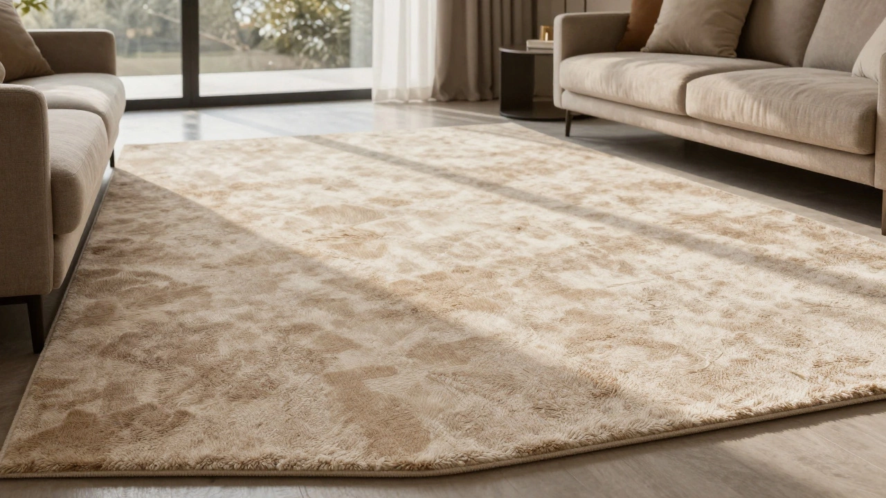
If there is one dominant theme in flooring this year, it is the embrace of warm neutrals. For a decade, cool greys ruled the roost. Designers loved them because they felt modern and industrial. But after years of pandemic living, people realized that cool greys can feel sterile. They lack the cozy factor needed for relaxation. Consequently, we are seeing a massive swing back toward beige, cream, and taupe-but with a twist.
We aren’t talking about the flat, sandy beiges of the early 2000s. The current favorites are multi-tonal blends. Think of a base of soft ivory mixed with hints of camel, oatmeal, and even subtle touches of warm brown. These variations do two things: they hide dirt surprisingly well because the eye gets confused by the pattern, and they add depth to the floor. A solid beige carpet can look flat and boring under certain lighting. A blended neutral carpet catches the light differently across its surface, creating a rich texture that feels expensive and lived-in.
Is beige carpet making a comeback?
Yes, absolutely. Beige has returned, but it is no longer a single flat color. Modern beige carpets feature multi-tonal fibers that mix cream, tan, and light brown to create visual interest and better stain resistance than solid colors.
Greige: The Ultimate Compromise
You cannot discuss current trends without mentioning "greige." It sounds like a typo, but it is the most significant color category in home decor right now. Greige is the perfect middle ground between grey and beige. It retains the sophistication and modern edge of grey but injects the warmth and comfort of beige. This makes it incredibly versatile. It works with both cool-toned furniture (like blue sofas) and warm-toned pieces (like walnut wood tables).
When shopping for greige carpet, pay attention to the undertones. Some greiges lean heavily towards pink or purple, which can clash with your existing decor. Look for greiges with earthy undertones-think clay, stone, or sand. These shades pair beautifully with natural materials like jute, rattan, and light oak flooring. In Wellington, where our weather can be quite grey and overcast, a greige carpet helps bring a sense of indoor sunlight into the home without feeling artificial.
Natural Tones and Earthy Greens
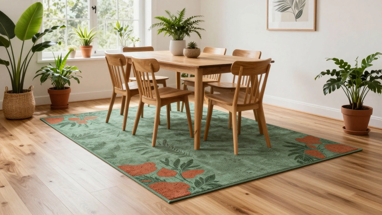
As sustainability becomes more important to consumers, so does the desire for nature-inspired interiors. This trend, often called "biophilic design," encourages bringing elements of the outdoors inside. For carpets, this means earthy greens, terracottas, and deep browns are gaining traction. You won’t see these as bright, primary colors. Instead, think moss green, olive, or sage. These muted greens evoke forests and gardens, providing a calming backdrop for busy households.
Terracotta and rust tones are also having a moment. They add a surprising amount of energy to a room without being overwhelming. A rug with hints of burnt orange or clay can serve as a focal point in a neutral room. These colors work particularly well in sunrooms, dining areas, or bedrooms where you want to create a cocoon-like atmosphere. They complement black metal fixtures and white walls exceptionally well, creating a balanced contrast.
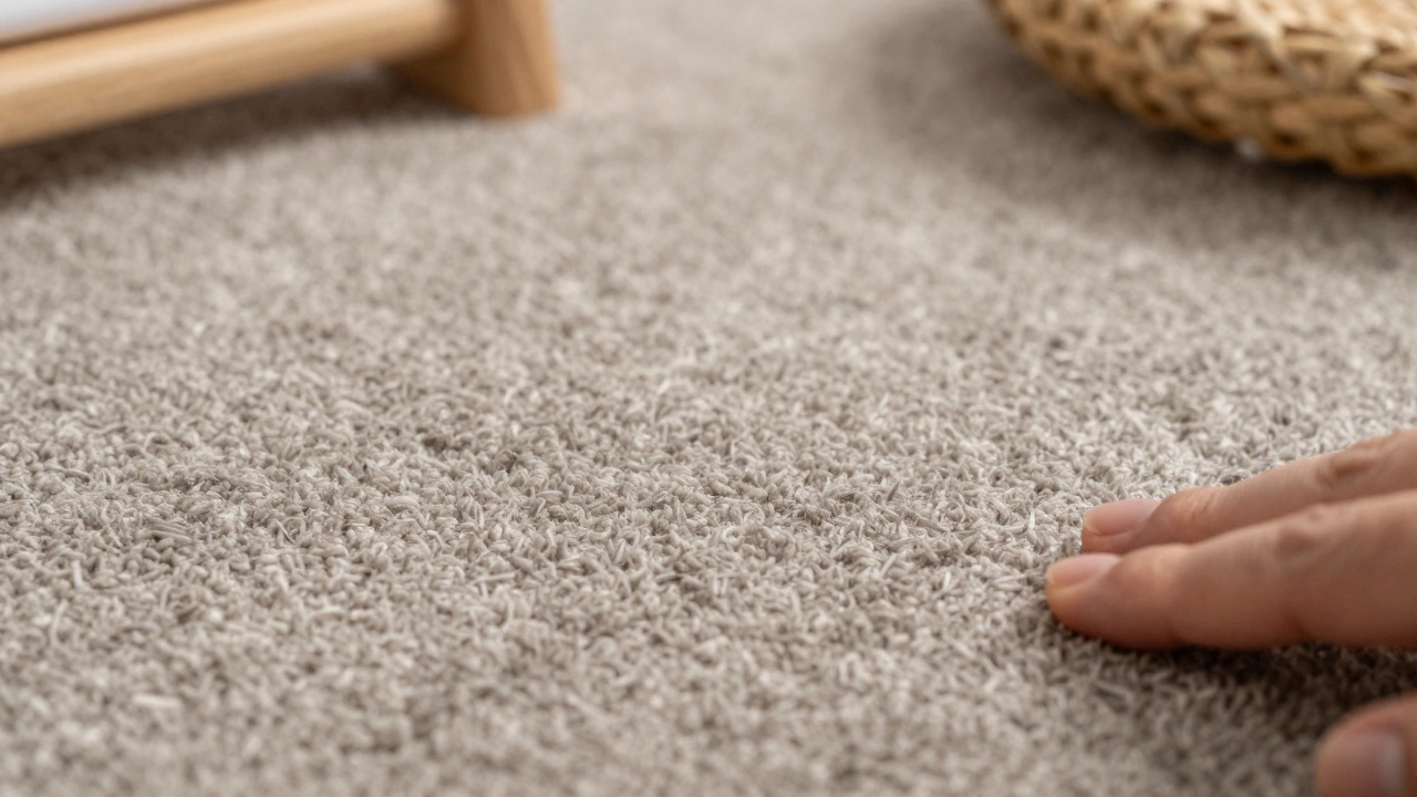
The Role of Texture Over Color
Here is a secret many designers know: texture often matters more than hue. A plain, smooth carpet in any color can look cheap if the pile is too low or uniform. Current trends favor high-pile shag rugs, looped textures, and cut-and-loop patterns. When you introduce texture, the color becomes secondary to the tactile experience. A textured beige carpet looks completely different depending on whether the light hits it from the left or the right. This dynamic quality keeps the room interesting.
If you are worried about showing footprints or vacuum lines, avoid high-pile plush carpets. Opt for frieze or twisted yarn constructions. These styles are designed to hide wear and tear, making them ideal for high-traffic areas like hallways and living rooms. The slight irregularity in the fiber direction breaks up the visual field, meaning spills and scuffs blend in rather than stand out.
Dark Accents vs. All-Over Dark Carpets
While all-over dark carpets are losing popularity, dark accents are rising. This approach involves using a lighter main carpet color and adding large area rugs in darker shades like navy, charcoal, or forest green. This strategy gives you the best of both worlds: the spaciousness and brightness of a light floor, combined with the coziness and definition of a dark rug. It also allows for easier updates. Changing a rug is far less expensive and disruptive than replacing wall-to-wall carpeting.
For those who prefer wall-to-wall solutions, consider a tonal pattern. Instead of a solid dark color, choose a carpet with a subtle geometric or organic pattern in varying shades of the same color family. This adds visual complexity without the risk of the room feeling cave-like. Patterns break up the monotony and can help mask stains, especially in homes with pets or young children.
Matching Your Lifestyle
Ultimately, the "best" color is the one that fits your life. If you have a black dog, a white carpet is a recipe for stress. If you entertain frequently, a light pastel might show wine spills too quickly. Practicality should never be ignored in favor of trends. Multi-tonal carpets are your best friend here. By mixing light and dark fibers in a single weave, manufacturers create surfaces that resist showing dirt naturally. A carpet that looks light from ten feet away but contains dark specks up close will stay looking fresh longer than a solid light color.
Consider the lighting in your home as well. North-facing rooms receive cooler, bluer light, which can make warm tones appear dull. In these spaces, you might want to lean slightly cooler within the neutral spectrum. South-facing rooms bask in warm, golden light, allowing you to pull off richer, deeper earth tones. Always test samples in your actual space before committing. Lay the swatch on the floor, not against the wall, and observe it at different times of day.
Sustainability and Material Choices
In 2026, the material of the carpet is just as important as its color. Consumers are increasingly aware of the environmental impact of synthetic fibers. Natural fibers like wool, jute, and sisal are seeing a resurgence. Wool, in particular, offers excellent durability, fire resistance, and natural stain repellency. Its natural crimp creates air pockets that provide insulation, keeping rooms warmer in winter and cooler in summer. Wool carpets come in a vast array of natural shades, from creamy whites to deep browns, often requiring minimal dyeing.
If you opt for synthetic options, look for recycled content. Many major brands now offer carpets made from recycled plastic bottles or fishing nets. These products perform similarly to traditional nylon or polyester but carry a lower carbon footprint. The colorfastness of recycled synthetics has improved significantly, meaning vibrant colors stay vibrant longer without fading under UV exposure.
Final Thoughts on Choosing Your Shade
Choosing a carpet color is a long-term decision. Unlike paint, which you can refresh every few years, carpet stays in place for a decade or more. Therefore, choose a color that you find comforting, not just trendy. Avoid extreme fads like neon accents or overly bold stripes unless you plan to change them soon. Stick to timeless foundations-warm neutrals, greiges, and earthy tones-and use accessories like throw pillows and curtains to inject seasonal colors. This way, your floor remains a stable, elegant base for your evolving style.
Remember, the goal is to create a space that feels like home. Whether you choose a soft oatmeal blend for maximum versatility or a moss-green textured rug for a touch of nature, ensure it reflects your personal taste and daily reality. Your floor should support your lifestyle, not dictate it.
What is the most popular carpet color for 2026?
The most popular carpet colors for 2026 are warm neutrals, specifically multi-tonal beiges, creams, and greiges. These shades offer warmth and versatility while hiding dirt better than solid colors.
Are grey carpets still in style?
Pure cool greyes are declining in popularity as they can feel cold and sterile. However, greige (a mix of grey and beige) remains very popular because it combines the modern look of grey with the warmth of beige.
What carpet color hides dirt best?
Multi-tonal carpets hide dirt best. These carpets mix light and dark fibers in a single weave, confusing the eye and making stains and footprints less visible than on solid-colored carpets.
Is beige carpet outdated?
No, beige is not outdated. It has evolved from flat, sandy shades to rich, multi-tonal blends that include hints of camel, oatmeal, and brown, making it a timeless and practical choice.
Should I choose a light or dark carpet?
Light carpets make rooms feel larger and brighter, which is ideal for small spaces. Dark carpets can feel cozier but may show lint and pet hair more easily. A mid-tone multi-color carpet often offers the best balance of aesthetics and practicality.
What are the benefits of wool carpet?
Wool carpet is durable, naturally fire-resistant, and repels stains. It provides excellent insulation and comes in a wide range of natural colors. It is also a sustainable option as it is a renewable resource.
How do I choose a carpet color for a north-facing room?
North-facing rooms receive cooler light, so choose warmer tones like beige, cream, or warm greige to counteract the chill. Avoid cool greys or blues, which can make the room feel even colder.
What is biophilic design in carpeting?
Biophilic design incorporates natural elements into interiors. In carpeting, this means using earthy colors like moss green, terracotta, and brown, as well as natural textures and materials like wool or jute.
Can I mix carpet colors in one room?
Yes, mixing a light wall-to-wall carpet with a darker area rug is a popular trend. It adds depth and definition to the space while allowing for easy updates to the decor.
What is the best carpet texture for high-traffic areas?
Frieze or twisted yarn textures are best for high-traffic areas. Their irregular construction hides footprints, vacuum lines, and wear better than smooth, high-pile plush carpets.