Color Palette Guide: Choose the Right Colors Fast
Staring at a blank wall or an empty box and wondering which colors will look good together? You’re not alone. Picking a color palette can feel like a puzzle, but with a few simple steps you can avoid the guesswork and end up with a look you love.
Start with One Base Color
Grab a shade you already like – maybe the blue of your favorite couch or the green of a kitchen gadget. Use that as your anchor. From there you can add lighter, darker, or complementary tones. A quick trick is to use a color wheel app or even a simple Google search for “color palette” and type in your base hue. The tool will suggest matching colors that already work together.
Use the 60‑30‑10 Rule
When you’re planning a room or a package design, think of the space as three parts: 60% dominant color, 30% secondary, and 10% accent. Paint the walls or the main panels in the dominant shade, bring in secondary tones with furniture or labels, and add pops of accent color with cushions, ribbons, or logos. This rule keeps the look balanced without forcing you to count exact percentages.
Another easy method is to pick a season as inspiration. Spring palettes tend to be light and fresh – pastel greens, soft pinks, and warm yellows. Autumn leans toward deep oranges, earthy browns, and muted reds. Choose a season that matches the mood you want and let the colors guide you.
Don’t forget lighting. A color can look different under natural light versus a warehouse lamp. Before you commit, hold a paint chip or a fabric swatch next to a window and then under the lights you’ll use most. If it still feels right, you’ve got a winner.
Finally, test the palette on a small area. Paint a corner of the wall or print a sample label. Live with it for a day. If you still like it after a few hours, you’re good to go.
Choosing a color palette doesn’t have to be a marathon. Pick a base, follow the 60‑30‑10 rule, consider the season, check the lighting, and test a sample. Follow these steps and you’ll end up with colors that feel right, whether you’re redecorating a living room or designing a shipping box.
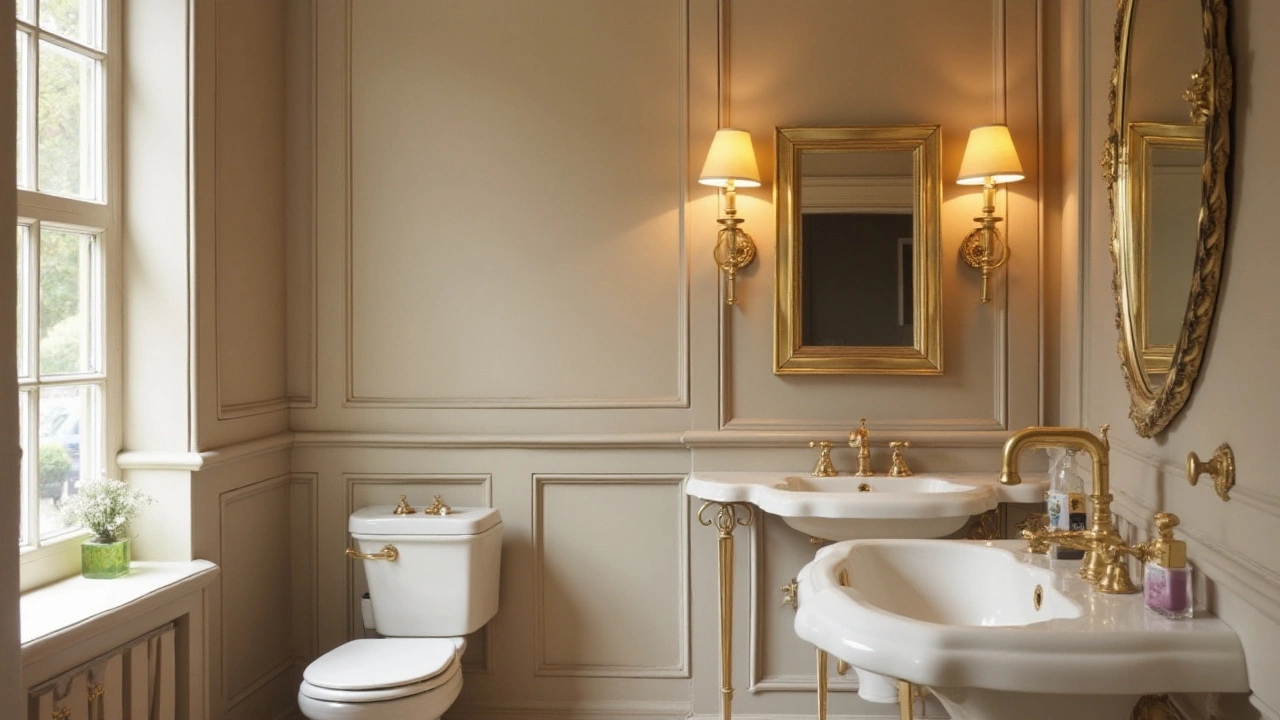
A bathroom that looks expensive is often defined by its color choices. Selecting the right colors can transform a simple space into a luxurious retreat. This article explores how neutral tones, metallic accents, and jewel hues can make a bathroom appear more opulent. Discover the best combinations to elevate your bathroom's look and feel with simple yet elegant color choices.
Dec, 8 2024