Should Curtains Be Lighter or Darker Than a Couch? A Simple Guide to Balanced Room Design
Curtain Color Advisor
Choose Your Room Setup
When you’re picking out curtains, it’s easy to get stuck on one question: should they be lighter or darker than your couch? The answer isn’t one-size-fits-all. It depends on the vibe you want, the light in your room, and what else is already there. But here’s the truth-most people overthink it. You don’t need a design degree to get this right. You just need to know a few basic rules and how to read your space.
Start with the mood you want
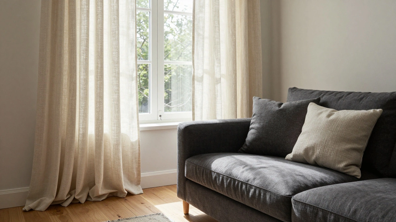
Lighter curtains make a room feel bigger, brighter, and airier. If your living room gets little natural light or feels cramped, go lighter. White, cream, or soft gray curtains bounce what little sunlight there is around. They also help your couch stand out as the main piece. This works especially well if your couch is dark-like charcoal, navy, or black. The contrast gives the room structure without weighing it down. Darker curtains do the opposite. They add depth, drama, and warmth. If your couch is light-think beige, linen, or pale blue-darker curtains like forest green, burgundy, or charcoal can ground the space. They turn the window into a focal point instead of letting it disappear. This is great for rooms with high ceilings or lots of windows, where you want to create a cozy, enveloping feel.Think about your couch first
Your couch is the biggest piece of furniture in the room. It’s not just a seat-it’s the anchor. So ask yourself: is it bold or neutral? If your couch is patterned or has strong color, you want curtains that don’t compete. Stick to solid, tonal shades. A navy couch? Try a slightly lighter or darker blue curtain. A cream linen sofa? A soft taupe or warm gray curtain will blend in quietly. If your couch is plain and neutral, that’s your chance to add personality. Dark emerald curtains can turn a gray sofa into the centerpiece of a stylish, layered look. You’re not matching-you’re elevating.Use the 60-30-10 rule
Interior designers use this trick to balance color in a room. Sixty percent is your dominant color (usually walls or large furniture), thirty percent is secondary (like your couch), and ten percent is accent (think pillows, art, or curtains). If your walls are light, and your couch is medium-toned, your curtains can be the 10% accent. That means going darker than the couch to create contrast. But if your walls are dark, and your couch is light, your curtains should be lighter still to avoid a heavy, closed-in feel. Think of it like a pyramid: the base is the largest area, the middle supports it, and the top draws your eye. Curtains are often the top.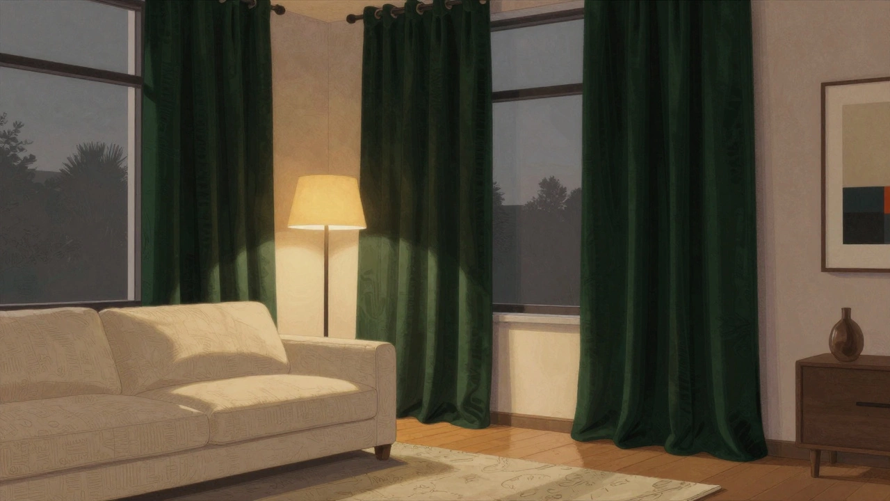
Lighting changes everything
This is where people get it wrong. A curtain that looks perfect in the store can turn muddy or washed out in your living room. Natural light shifts during the day. Artificial light changes the tone-warm bulbs make reds look richer, cool bulbs make grays look colder. Test your curtain fabric in the actual room. Hang a swatch on the window for a full day. Watch how it looks at 8 a.m., noon, and 7 p.m. If it disappears in daylight, it’s too close in tone to your walls. If it looks too harsh under evening lamps, it might be too dark or too saturated. In Wellington, where winters are long and skies are often gray, lighter curtains are a safe bet. They pull in what little sun we get. But if you’ve got a sunny corner or a big window facing north, a rich, dark curtain can make that spot feel like a private retreat.Texture matters as much as color
You don’t have to pick between light and dark. You can mix both with texture. A light linen curtain paired with a dark velvet couch? That’s a classic combo. The contrast in material softens the color difference. The linen feels airy, the velvet feels luxurious. Together, they balance each other. Same goes for woven cotton, sheer panels, or blackout linings. A sheer curtain in a light color lets in light but still adds a layer. Behind it, you can hang a heavier, darker drape for evenings. This gives you control-light by day, intimacy by night.What about patterns?
Patterns in curtains can be tricky. If your couch has a print-stripes, florals, geometric-your curtain should be solid. Otherwise, the room feels busy. But if your couch is plain, you can afford to go bolder. A subtle pattern in the same color family as your couch (like a tonal damask in navy and charcoal) adds interest without clashing. Avoid large, loud patterns unless your whole room is minimalist. A floral curtain with a solid navy couch? Fine. A floral curtain with a patterned sectional? Too much.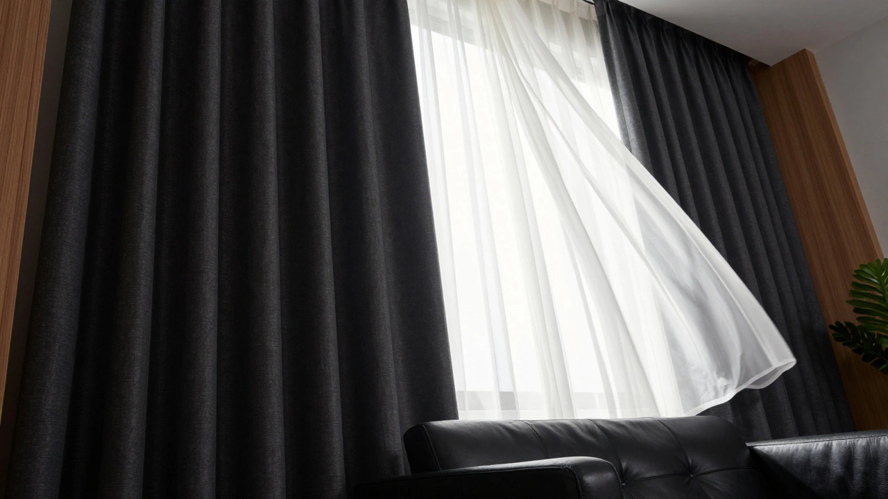
Real examples that work
- A light gray sofa with navy blue curtains and white walls. The navy pulls the eye down, the gray keeps it calm, and the white keeps it open. This combo is timeless. - A beige linen couch with olive green curtains and wooden floors. The green adds earthiness. It’s warm without being loud. - A black leather couch with cream linen curtains. High contrast, but soft. The curtains feel like a breath of air. - A bright teal couch with white sheer curtains. The teal is the star. The curtains let it shine.What to avoid
Don’t pick curtains that are exactly the same color as your couch. It makes the window blend into the furniture. You lose definition. Don’t go too dark if your room is small or has low ceilings. Dark curtains can make the ceiling feel lower. Don’t assume white is always safe. Off-white, cream, or eggshell work better than stark white, which can look cold or clinical.Final tip: trust your gut
You live in this space. You know how it feels. If a curtain makes you smile when you walk in, that’s the one. Design rules help you avoid mistakes-but they don’t replace your own taste. Try this: lay your curtain fabric on the couch. Step back. Close one eye. Does it look balanced? Does it feel right? If yes, go for it. If it feels off, try another. There’s no single correct answer-just the one that feels like home.Should curtains be lighter or darker than the couch for a small room?
For small rooms, lighter curtains are usually better. They help reflect light and make the space feel larger. Pair them with a darker couch to create contrast without closing in the room. Avoid heavy, dark drapes-they can make ceilings feel lower and the room feel cramped.
Can I match curtains and couch exactly?
Matching curtains and couch exactly is not recommended. It makes the window blend into the furniture, losing visual structure. Instead, go one shade lighter or darker, or use texture to create separation. A navy couch with a slightly lighter blue curtain looks intentional, not mismatched.
Do curtain colors need to match the walls too?
Not necessarily. Curtains don’t have to match the walls-they should relate to the biggest furniture piece, which is usually the couch. If your walls are neutral, curtains can be the accent. If your walls are bold, keep curtains more neutral to avoid overwhelming the space.
Are blackout curtains a good choice if my couch is light?
Yes, especially if you want to control light or add privacy. Blackout curtains in a deep color like charcoal or navy work well with light couches. They create a cozy, intentional contrast. Just make sure the fabric has texture or a subtle weave so it doesn’t look flat or cheap.
What if my couch is patterned?
Go with solid curtains in one of the couch’s background colors. If your patterned couch has cream, gray, and blue, pick a solid curtain in cream or light gray. This keeps the focus on the couch without competing. Avoid patterns in both-too much visual noise.
Do I need to match curtains to other furniture?
No. Curtains don’t need to match armchairs, rugs, or side tables. Focus on the couch as the anchor. Other pieces can pick up tones from the curtains or couch to create cohesion. For example, a rug with a hint of the curtain’s color ties the room together without matching exactly.