Most Popular Carpet Colors for 2024: Trends, Data & Design Tips
Carpet Color Suitability Calculator
Your Room Details
Recommendation
Select your room details and click "Find Best Match" to see our recommendation.
You walk into a room and the floor sets the tone before you even look at the furniture. If you’ve been staring at swatches lately, wondering which shade will actually last in your home, you’re not alone. The search for the perfect carpet color is one of those decisions that feels small until it’s installed-and then it defines your space for years.
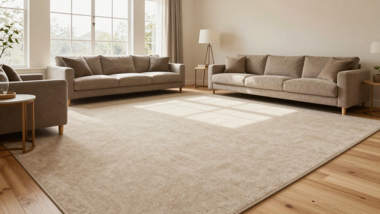
So, what was the big winner in 2024? It wasn’t a bold primary or a stark white. The most popular carpet color for 2024 was undeniably **warm beige**, specifically shades leaning toward greige (a mix of gray and beige) and soft taupe. These tones dominated sales reports from major flooring retailers like Shaw Industries and Mohawk Group, driven by a desire for spaces that feel both grounded and flexible.
Why did warm beige become the top choice?
Warm beige struck the perfect balance between practicality and aesthetics. Unlike cool grays, which can sometimes feel sterile or highlight red dirt, warm beiges hide everyday messes while adding a layer of comfort to any room. They also pair effortlessly with the wood tones and metal finishes that were trending in 2024.
The Rise of Greige and Warm Neutrals
If you looked at interior design forecasts for 2024, "greige" was everywhere. This isn’t just a marketing term; it’s a practical evolution of how we live. For years, cool gray ruled the roost. It felt modern, sleek, and aligned with minimalist trends. But as people spent more time at home, they realized that cool gray could feel a bit cold-literally and emotionally.
Greige is a hybrid color combining the neutrality of gray with the warmth of beige. It offers the versatility of gray without the harshness.In 2024, homeowners shifted toward warmer undertones. Think sand, camel, oatmeal, and soft taupe. These colors bring a sense of organic calm to a room. They mimic natural materials like jute, sisal, and light wood, bridging the gap between hard surfaces and soft textiles. If you have oak or walnut flooring elsewhere in your home, a warm beige carpet creates a seamless flow rather than a jarring contrast.
This shift wasn’t just about looks. It was about lighting. Many homes, especially in northern climates or rooms with north-facing windows, don’t get enough warm sunlight. A cool gray carpet can make these spaces feel dim and cave-like. Warm beige reflects light differently, bouncing it around in a way that makes a room feel brighter and more inviting without needing expensive renovations.
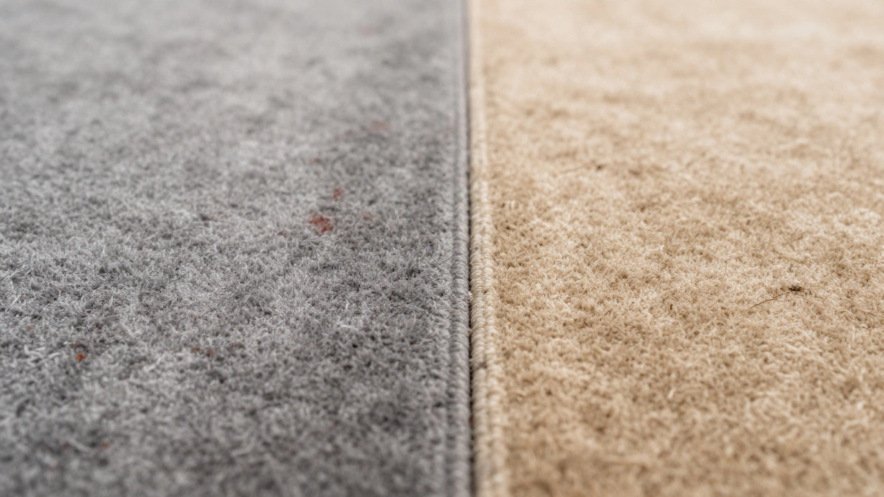
Why Cool Gray Lost Its Crown
Let’s be honest: cool gray had a great run. From 2015 to 2022, it was the default choice for new builds and renovations. But its popularity peaked right before the pandemic changed how we used our homes. Suddenly, that sleek office vibe didn’t work so well in a living room where kids were playing and pets were sleeping.
The problem with cool gray carpets is twofold. First, they show certain types of dirt surprisingly well. Red clay, rust stains, and even some food spills stand out starkly against a blue-based gray. Second, as paint trends moved toward earthy terracottas, sage greens, and creamy whites, cool gray started to clash. It felt dated, almost industrial, in spaces trying to achieve a cozy, "grandmillennial" or "organic modern" aesthetic.
In 2024, if you did see gray carpets, they were almost exclusively warm grays-ones with brown or yellow undertones. Pure blue-gray or silver-gray saw a significant drop in demand. Retailers reported slower turnover on these SKUs, leading them to stock up on warmer alternatives.
The Enduring Appeal of Navy and Deep Blues
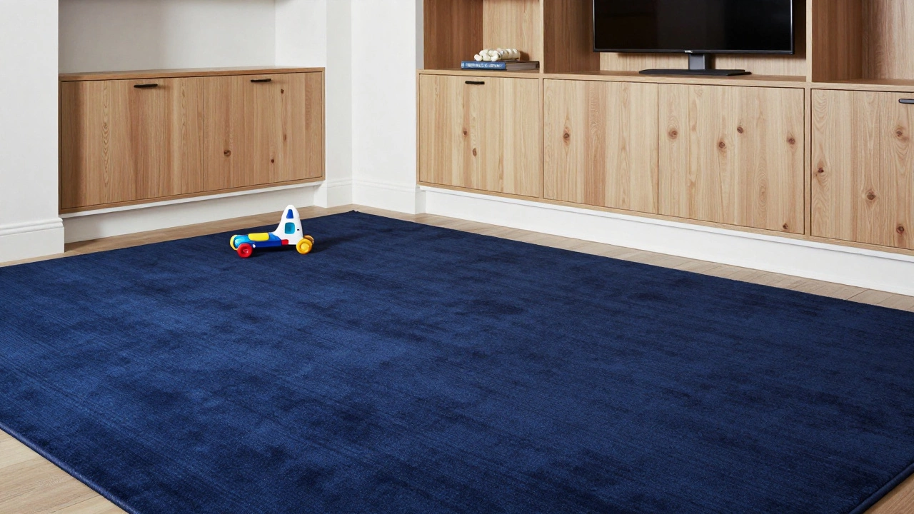
While neutrals took the top spot, dark colors didn’t disappear. In fact, navy blue remained a strong contender, particularly for high-traffic areas like family rooms, entryways, and basements. Why? Because it hides wear and tear better than almost any other color.
Navy Blue Carpet is a deep, rich blue hue that provides excellent durability and stain resistance. It adds depth and sophistication to large open-plan spaces.Navy works because it absorbs light rather than reflecting it. This means scuffs, footprints, and vacuum marks are much less visible. It also pairs beautifully with the white trim and light wood cabinets that are still popular in many kitchens and living areas. If you’re worried about a dark carpet making a room feel small, remember that it’s all about scale. A large area rug in navy can anchor a room, creating a focal point that draws the eye inward rather than shrinking the walls.
In 2024, we saw a rise in tonal variations of blue-from slate blues to midnight indigos. These shades offered a slightly softer alternative to traditional navy, allowing for more flexibility in decor. You could swap out cushions and throws easily without changing the entire mood of the room.
Sage Green and Earth Tones: The Eco-Friendly Choice
If 2024 had a secondary trend, it was the embrace of nature-inspired hues. Sage green, olive, and muted terracotta gained traction, driven by a broader cultural interest in sustainability and biophilic design. People want their homes to feel connected to the outdoors, even when they’re stuck inside.
Sage green is particularly versatile. It’s soft enough to act as a neutral but distinct enough to add character. It pairs wonderfully with white, cream, and natural wood tones. More importantly, it has a calming effect. Studies in environmental psychology suggest that green hues reduce stress and promote relaxation, making it an ideal choice for bedrooms and meditation spaces.
Terracotta and burnt orange were bolder choices, often used as accent rugs rather than wall-to-wall installations. These colors brought warmth and energy to a space, complementing the cooler tones of stone and concrete that are common in modern architecture. They worked especially well in sun-drenched rooms where the natural light enhanced their richness.
Practical Considerations: Hiding Dirt and Wear
Beauty is important, but functionality matters just as much. When choosing a carpet color, you need to think about how it will age. Light carpets show dust and pet hair easily. Dark carpets show lint and scuffs. So, what’s the sweet spot?
Multicolored or textured carpets are the best at hiding dirt. A solid warm beige might look pristine on day one, but after a few months, foot traffic patterns will become visible. However, a beige carpet with subtle variations in tone-a heathered or tweed texture-can mask daily wear much better. This is why many manufacturers in 2024 focused on "solution-dyed" fibers, which offer consistent color throughout the fiber, preventing fading and making cleaning easier.
If you have pets, avoid light pastels and stark whites. Stick to mid-tone neutrals like taupe, warm gray, or medium brown. These colors blend with pet fur and hide occasional accidents. For households with young children, consider darker tones like charcoal or navy in playrooms and hallways, where spills and stains are more frequent.
| Color Category | Best For | Dirt Visibility | Stain Resistance |
|---|---|---|---|
| Warm Beige/Greige | Living Rooms, Bedrooms | Moderate | Good |
| Navy/Dark Blue | Family Rooms, Entryways | Low | Excellent |
| Sage Green | Bedrooms, Offices | Moderate | Good |
| Light Pastels | Guest Rooms, Low-Traffic Areas | High | Poor |
| Dark Brown/Charcoal | Hallways, Playrooms | Low | Excellent |
How Lighting Changes Everything
You can’t pick a carpet color in isolation. You have to consider how light interacts with it. Natural light changes throughout the day, and artificial light varies in temperature. A carpet that looks perfect in the showroom might look completely different in your home.
Here’s a simple test: take a sample of your chosen carpet color and place it in the room where you plan to install it. Look at it in the morning, midday, and evening. Check it under both natural sunlight and your existing light fixtures. If you have LED bulbs, note their color temperature. Warm white LEDs (2700K-3000K) will enhance warm beiges and browns, while cool white LEDs (4000K+) will make grays and blues pop.
In rooms with limited natural light, avoid very dark carpets unless you have ample artificial lighting. They can make a space feel cavernous. Instead, opt for lighter neutrals or multicolored patterns that reflect more light. Conversely, in sun-drenched rooms, darker tones can help absorb excess glare and create a cozier atmosphere.
Fiber Type Matters Just as Much as Color
The material of your carpet affects how the color appears over time. Nylon is the most durable and resistant to staining, making it a popular choice for high-traffic areas. Polyester offers vibrant colors and softness but may show wear faster. Wool is luxurious and naturally stain-resistant but requires more care.
In 2024, there was a noticeable shift toward recycled nylon and triexta fibers. These materials not only offer environmental benefits but also provide excellent color retention. Triexta, in particular, is known for its ability to repel water and stains, keeping the carpet looking fresh longer. When choosing a color, consider pairing it with a high-quality fiber to ensure longevity.
Matching Your Carpet with Existing Decor
Your carpet should complement, not compete with, your existing furniture and wall colors. If you have bold, colorful furniture, a neutral carpet like warm beige or gray allows those pieces to shine. If your decor is mostly monochromatic, a patterned or colored rug can add visual interest.
Consider the undertones of your walls and trim. If your walls have yellow or pink undertones, a cool gray carpet might look muddy. Pair it with a warm beige instead. If your walls are crisp white with blue undertones, a cool gray or navy carpet will harmonize beautifully.
Don’t forget about your flooring transitions. If you’re installing carpet in one room and hardwood in another, choose a carpet color that complements the wood tone. Warm woods pair well with warm beiges and browns, while cool woods work with grays and blues.
Final Thoughts on Choosing Your Carpet Color
Choosing the right carpet color is a personal decision, but understanding the trends can guide you. In 2024, warm beige emerged as the top choice because it balances beauty with practicality. It’s versatile, easy to match, and forgiving of everyday life. Whether you lean toward greige, navy, or sage green, the key is to consider your lifestyle, lighting, and existing decor.
Take your time. Test samples in your home. Think about how the color will age. With the right choice, your carpet won’t just be a floor covering-it’ll be the foundation of a comfortable, stylish home.
Is gray carpet still popular in 2024?
Yes, but primarily warm grays with brown or yellow undertones. Cool, blue-based grays have declined in popularity due to their tendency to feel sterile and show certain types of dirt.
What is the best carpet color for hiding pet hair?
Mid-tone neutrals like taupe, warm gray, and medium brown are best. Avoid light pastels and stark whites, which show pet hair clearly. Multicolored or textured carpets also help mask hair.
Does carpet color affect room size perception?
Yes. Lighter colors like warm beige and cream can make a room feel larger and airier. Darker colors like navy or charcoal can make a space feel cozier but potentially smaller if not balanced with adequate lighting.
How do I choose between wool and synthetic carpet?
Wool is luxurious, naturally stain-resistant, and long-lasting but more expensive. Synthetic options like nylon and polyester are more affordable, durable, and easier to clean. Choose based on your budget and traffic levels.
Can I use different carpet colors in different rooms?
Absolutely. Using different colors can define spaces and add variety. Just ensure the tones complement each other to maintain a cohesive flow throughout your home.